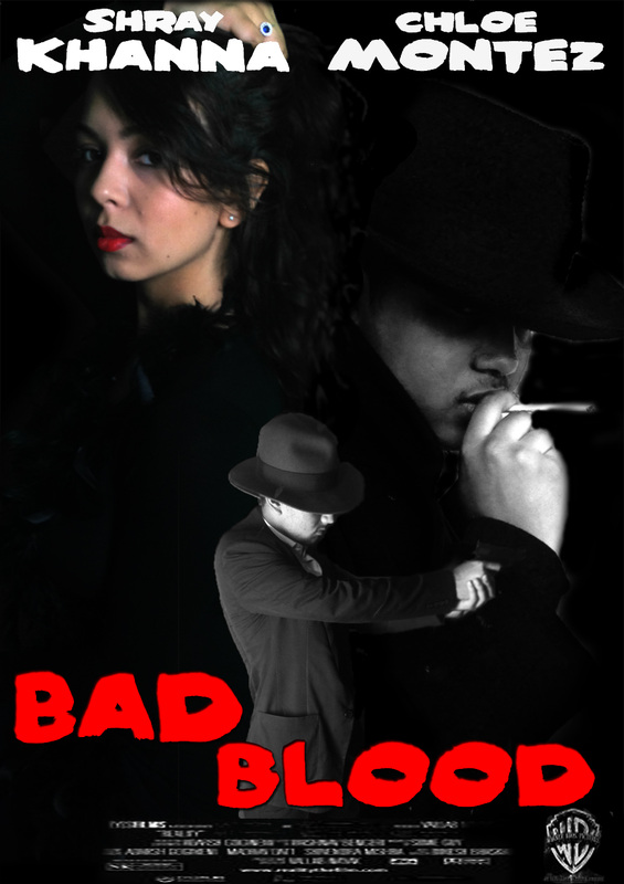
Film Noir Poster Analysis
Sin City
|
Sin City differs from the stereotypical noir film as it categories itself within the neo-noir category. The layout of it's main poster is interesting. The leading characters are placed at the top of the screen in order of significance- Bruce Willis at the front and in the middle. Each character is shown in a pose that roughly hints at or describes their personality and give an insight into their part in the film.
The poster does contain colour but follows a minimalistic colour scheme- black, white and grey mostly. This is clever because it highlights the title of the film as that is in a bright red colour. The first thing your eyes are drawn to is the title Sin City. Connotations of red being blood, love and anger link to the narrative of the movie as well. The images are placed and edited very well considering that most of them over lap each other. The only colourless picture at the bottom left hand corner is blended in extremely well at the bottom of Bruce Willis's coat. None of the characters look as if they are floating in mid air because the space on the poster is very well used. An effect of rain covers the whole poster which adds a cold and harsh feel to everything. The rain is also suggestive to the story line and is a typical noir convention. The title seems as though it has been painted in either red paint or blood, allowing our imagination to make the choice. This suggests that the movie is about murder and contains blood or gore. It is not in a formal or classic font which questions its intention. The director's name's are much smaller and remain in a simple white coloured font. There is no cast listing, probably because the cast is quite large in terms of lead actors. Women are represented as being quite seductive and exotic in this particular poster. Their relation to men is not very clear as Jessica Alba is the shown to be the second most important character by her positioning. However, both the women in this poster are shown to be wearing slightly exposing clothing and are made to look quite attractive and luring. |
Sunset Boulevard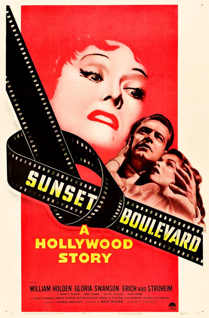
|
This film noir poster of Sunset Boulevard is great to analyse for various reasons. The structure of this poster is very interesting and unique. It is very plain and simple but powerful at the same time. It only has two pictures, one of a scared female's face and a couple holding each other. The title underlines them in a roll of twisted film. Beneath that a tag line is present in capital letters. Followed by the cast names and billing block at the bottom of the poster.
A vibrant red colour fills the page as it's background while engulfing all the pictures on the poster. The female's face in the middle is shaded in red, so much so that her hair is almost not visible. The couple are also shaded red. This can lead the viewer to understand what they like about this feature, but mostly hinting that there will be murder or blood in this film- connotations of the colour red. This drench of red almost gives a feel that everything relevant is covered in blood while providing a slight understanding of the film's narrative. All predominant text is or at least has a hint of yellow, a colour that contrasts the red very well. The images are blended well with the red with the slight exception of the couple who seems to have an outline- like a cut and pasted picture. Although this could be used as an effect. Due to the film that bears the title being so large, we as the audience believe that the movie will have something to do with Hollywood or the acting profession. All letters are in capitals which suggests their importance. However the title is the biggest in size and has a suiting Hollywood style font. The cast list is small in size, depending on the importance of the actor. The role of women in this poster is significant as the main image is of a woman. While this is the case, the frightened expression on both the women's faces suggest that they are scared or in danger by someone superior. The man is also the one protecting the woman which adds to the representation of women. |
Kiss of Death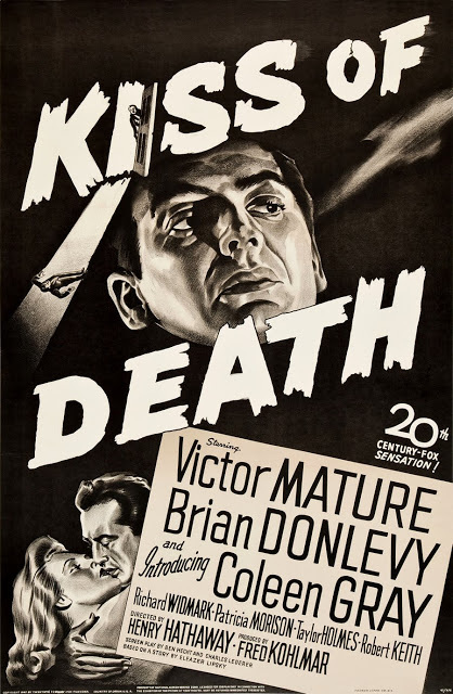
|
This classic film noir poster of Kiss of Death is painted in black and white. Its layout is quite interesting and clever. The title is in bold capital letters that cover half the poster with the face of someone who seems to be the protagonist. There is a picture of a kiss taking place at the bottom left of the poster to possibly resemble the title of the film. The cast and director's list is significantly big and bold. The title contains little pictures that have been formed withing it of a door and a man falling. The poster in itself seems to be rather simple but effective and mysterious, suggesting the narrative of the movie.
There are no other colours used on this poster except black white and grey. This is a key indicator that it is a film noir. The images of the faces of the characters are painted in such a way that they almost provide a chiaroscuro lighting effect which is quite powerful. Everything does seem a bit animated however, due to each image being painted. Although the head of the protagonist seems to be floating a little, it is generally covered by the title so the fault isn't that prominent. The title is in bold white capital letters and the font makes the letters look as though they are planks of broken wood or have been painted on by a brush. This adds a good contrast to the shaded faces and black background. The 'starring' section however shows the names of the actors and director in a clean straight font, almost as if it has been typed. This also contrasts the big 'in your face' title. There is only one woman in this poster and she is not portrayed to be significant. In fact, she is shown kissing a man and he is the one who seems to be in control. So the representation of women in this poster is insignificant. The poster does have many connotations of a film noir poster with the lighting effects, representation of women and structure. |
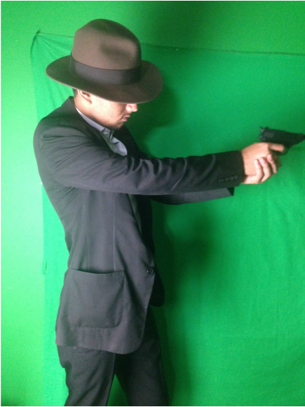
Drafts
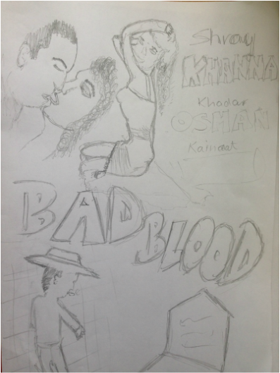
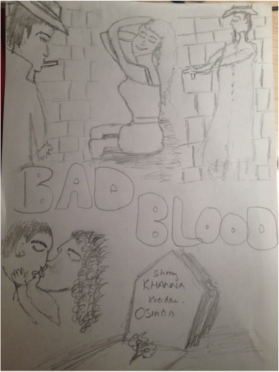
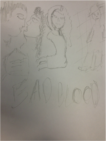
Original Images
|

|

Film Noir Poster